Gestion et analyse des données
Pareto Diagram
Débloquer l'Efficacité dans le Pétrole et le Gaz : Le Pouvoir du Diagramme de Pareto
L'industrie pétrolière et gazière est intrinsèquement complexe, caractérisée par des enjeux élevés, des délais serrés et une pression constante pour optimiser l'efficacité. Un outil crucial dans cette quête d'optimisation est le Diagramme de Pareto, une représentation visuelle puissante qui aide à identifier et à prioriser les causes les plus impactantes derrière divers défis opérationnels.
Le Principe de Pareto en Action :
Le Diagramme de Pareto est basé sur le Principe de Pareto, également connu sous le nom de "règle des 80/20", qui stipule que 80 % des effets proviennent de 20 % des causes. Dans le contexte du pétrole et du gaz, cela se traduit par quelques facteurs clés qui conduisent à la majorité des problèmes, qu'il s'agisse de temps d'arrêt, de pertes de production, d'incidents de sécurité ou de problèmes environnementaux.
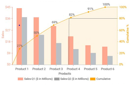
Visualiser les Données :
Un Diagramme de Pareto combine deux éléments clés :
- Histogramme : Un diagramme à barres qui représente visuellement la fréquence d'occurrence de chaque cause. Les barres les plus hautes représentent les causes les plus fréquentes, ce qui signifie leur impact significatif.
- Courbe de Fréquence Cumulée : Une ligne qui suit le pourcentage total d'occurrences prises en compte par chaque cause lorsque vous vous déplacez de gauche à droite. Cela permet d'identifier rapidement les causes "essentielles" responsables de la majorité des problèmes.
Applications dans le Pétrole et le Gaz :
Le Diagramme de Pareto trouve une large gamme d'applications dans le secteur pétrolier et gazier, notamment :
- Optimisation de la Production : Identifier les principales causes de temps d'arrêt dans les opérations de forage, de production ou de traitement, permettant des efforts d'amélioration ciblés.
- Amélioration de la Sécurité : Identifier les facteurs contributifs les plus fréquents aux accidents et aux incidents évités de justesse, permettant des mesures proactives pour minimiser les risques.
- Gestion de l'Environnement : Analyser les sources de pollution ou de production de déchets, guidant les interventions ciblées pour la protection de l'environnement.
- Contrôle de la Qualité : Identifier les facteurs clés menant aux défauts de produits, contribuant à améliorer la qualité globale des produits et à réduire les retouches.
Avantages de l'Utilisation d'un Diagramme de Pareto :
- Priorisation : Aide à se concentrer sur les facteurs les plus importants à l'origine des problèmes, permettant une allocation efficace des ressources.
- Prise de Décisions Basées sur les Données : Fournit une représentation visuelle claire et concise des données, permettant une prise de décision éclairée.
- Communication Améliorée : Communique efficacement des données complexes aux parties prenantes, favorisant la compréhension et l'adhésion aux initiatives d'amélioration.
- Amélioration Continue : Permet un suivi continu des progrès et des ajustements aux stratégies d'optimisation.
Conclusion :
Le Diagramme de Pareto est un outil précieux pour les entreprises pétrolières et gazières qui cherchent à améliorer leurs performances, à renforcer la sécurité et à minimiser l'impact environnemental. En comprenant les quelques causes essentielles derrière les défis opérationnels, les entreprises peuvent prioriser leurs efforts et réaliser des améliorations significatives en termes d'efficacité et d'efficience. Le Diagramme de Pareto permet une prise de décision basée sur les données, propulsant l'industrie vers un avenir plus durable et plus profitable.
Test Your Knowledge
Quiz: Unlocking Efficiency in Oil & Gas: The Power of the Pareto Diagram
Instructions: Choose the best answer for each question.
1. What is the Pareto Principle, also known as the "80/20 rule"?
a) 80% of the work is done by 20% of the team. b) 80% of the effects come from 20% of the causes. c) 80% of the profits are generated by 20% of the products. d) 80% of the resources are allocated to 20% of the projects.
Answer
b) 80% of the effects come from 20% of the causes.
2. What are the two key elements of a Pareto Diagram?
a) Bar chart and pie chart b) Histogram and line plot c) Scatter plot and line graph d) Flowchart and timeline
Answer
b) Histogram and line plot
3. How does a Pareto Diagram help in Production Optimization?
a) By identifying the most frequent causes of production delays. b) By visualizing the flow of production processes. c) By tracking the progress of production targets. d) By analyzing the cost of production materials.
Answer
a) By identifying the most frequent causes of production delays.
4. Which of the following is NOT a benefit of using a Pareto Diagram?
a) Prioritization of improvement efforts b) Improved communication among stakeholders c) Elimination of all operational challenges d) Data-driven decision making
Answer
c) Elimination of all operational challenges
5. What is the main purpose of the cumulative frequency line in a Pareto Diagram?
a) To show the total number of occurrences. b) To identify the most frequent causes. c) To highlight the "vital few" causes responsible for the majority of issues. d) To compare the frequency of different causes.
Answer
c) To highlight the "vital few" causes responsible for the majority of issues.
Exercise: Applying the Pareto Diagram
Task: Imagine you are working in an oil and gas company, and you've gathered data on the main causes of downtime in your drilling operations. The data is as follows:
| Cause | Frequency | |---|---| | Equipment failure | 20 | | Maintenance delays | 15 | | Weather interruptions | 10 | | Human error | 8 | | Supply chain issues | 7 | | Other | 5 |
Instructions:
- Construct a Pareto Diagram using the given data.
- Identify the "vital few" causes responsible for the majority of downtime.
- Briefly describe how you would use this information to improve drilling efficiency.
Exercice Correction
1. **Constructing the Pareto Diagram:** - Draw a histogram with the causes on the x-axis and frequency on the y-axis. - Label the bars with the frequency of each cause. - Draw a cumulative frequency line, starting at 0% and adding the percentage of occurrences for each cause as you move from left to right. 2. **Identifying the vital few:** - Equipment failure (20) and Maintenance delays (15) account for the largest portion of downtime, making them the "vital few". 3. **Improving Drilling Efficiency:** - **Focus on Equipment Failure:** Invest in preventive maintenance, implement rigorous equipment inspection procedures, and explore upgrades to more reliable equipment. - **Address Maintenance Delays:** Streamline maintenance processes, improve parts availability, and possibly consider outsourcing some maintenance tasks. - The remaining causes should also be addressed, but with less priority than the "vital few".
Books
- The Pareto Principle: How to Achieve Extraordinary Results by Focusing on the Vital Few by Richard Koch: This book delves into the principles behind the Pareto Principle and offers practical strategies for applying it across various domains, including business.
- Lean Six Sigma: A Practical Guide for Managers by David A. Westcott: This book introduces the Lean Six Sigma methodology and covers tools such as the Pareto Diagram for improving efficiency and reducing waste.
- Six Sigma for Dummies by Michael George: This book offers a comprehensive guide to Six Sigma, including how to use Pareto Diagrams for process improvement and quality control.
Articles
- "Pareto Analysis: A Powerful Tool for Process Improvement" by ASQ (American Society for Quality): This article provides a concise overview of the Pareto Diagram, its benefits, and steps for creating it.
- "The Power of the Pareto Diagram" by Quality Digest: This article explores the application of Pareto Diagrams in various industries, including manufacturing, healthcare, and services.
- "Using Pareto Charts to Analyze Safety Data" by Occupational Safety and Health Administration (OSHA): This article demonstrates how to use Pareto Diagrams to analyze safety data and identify key contributing factors to accidents.
Online Resources
- "Pareto Chart" by Wikipedia: Provides a detailed definition, history, and applications of Pareto Diagrams with visual examples.
- "Pareto Chart" by QualityTools.com: This website offers a step-by-step guide on how to create a Pareto Diagram and interpret the results.
- "Pareto Chart Templates" by Microsoft Office: Download pre-designed templates for creating Pareto Diagrams in Excel, PowerPoint, and Word.
Search Tips
- "Pareto Diagram Oil & Gas": Search for articles and resources specifically related to the use of Pareto Diagrams in the oil and gas sector.
- "Pareto Diagram Case Study Oil & Gas": Look for case studies showcasing real-world applications of Pareto Diagrams in improving oil and gas operations.
- "Pareto Diagram Template Excel": Find free Excel templates for creating Pareto Diagrams to analyze your own data.
Techniques
Unlocking Efficiency in Oil & Gas: The Power of the Pareto Diagram
Chapter 1: Techniques for Creating a Pareto Diagram
The creation of a Pareto Diagram involves several key steps to ensure accurate and insightful results. These steps translate raw data into a powerful visual representation that facilitates decision-making.
1. Data Collection: Begin by identifying the problem you want to analyze. This could be anything from equipment downtime to safety incidents. Then, systematically collect relevant data over a defined period. Ensure data accuracy and consistency across the collection process. Examples of data to collect in the Oil & Gas sector might include:
- Downtime events: Type of equipment failure, duration of downtime, cause of failure.
- Safety incidents: Type of incident, location, contributing factors.
- Production losses: Reason for loss, volume of loss, time of occurrence.
2. Data Categorization: Organize the collected data into meaningful categories. These categories should represent the different causes or factors contributing to the problem. Consolidation of similar causes into broader categories may be necessary for clarity. For instance, multiple types of pump failures could be grouped under "Pump Malfunctions."
3. Frequency Counting: Count the number of occurrences for each category. This provides the basis for the histogram component of the Pareto Diagram.
4. Ranking and Sorting: Sort the categories from the most frequent to the least frequent. This is crucial for highlighting the "vital few".
5. Calculation of Cumulative Frequency: Calculate the cumulative percentage of occurrences for each category. Start with the most frequent category and add the percentage of each subsequent category.
6. Diagram Construction: Create the diagram using the following:
- Histogram: Represent the frequency of each category using bars. The height of each bar should be proportional to its frequency.
- Cumulative Frequency Line: Plot the cumulative percentage on a separate scale, connecting the points to create a line graph. This line visualizes the cumulative impact of each category.
7. Chart Labeling and Titling: Clearly label the axes (frequency and cumulative percentage), categories, and provide a descriptive title indicating the problem being analyzed and the time period.
Chapter 2: Models and Interpretations of Pareto Diagrams
While the basic Pareto Diagram is a simple yet powerful tool, understanding its underlying model and interpretations is essential for effective utilization.
The Pareto Diagram relies on the Pareto Principle (80/20 rule), suggesting that approximately 80% of effects stem from 20% of causes. However, this ratio is not always exactly 80/20; it's a guideline rather than a strict rule. The diagram visually reveals the extent to which this principle holds for a specific problem.
Interpretations:
- Identification of Vital Few: The tallest bars and the steepest initial rise of the cumulative frequency line identify the "vital few" causes contributing most significantly to the problem. Focusing improvement efforts on these areas yields the greatest impact.
- Prioritization: The diagram clearly prioritizes causes, enabling efficient allocation of resources for corrective actions.
- Impact Assessment: The cumulative frequency line shows the cumulative impact of addressing causes sequentially. This helps determine the effectiveness of addressing specific causes.
- Limitations: The Pareto Diagram might not capture complex interactions between different causes or indirect effects. It relies on the accuracy and completeness of collected data. It's crucial to consider contextual factors during analysis.
Different models of Pareto analysis exist, for example using weighted values for each category if the impact of each category isn't just about frequency but also severity. This adds complexity but can provide a more nuanced understanding.
Chapter 3: Software for Pareto Diagram Creation
Several software tools facilitate the creation and analysis of Pareto Diagrams, simplifying the process and enhancing accuracy.
Spreadsheet Software (Excel, Google Sheets): These are readily accessible and provide built-in charting capabilities. While requiring manual data input and calculations, they offer flexibility and are sufficient for simpler analyses.
Statistical Software (Minitab, SPSS, R): These offer advanced statistical functions, including automated Pareto Diagram generation and more sophisticated analyses, particularly useful for large datasets or complex scenarios.
Business Intelligence (BI) Tools (Tableau, Power BI): BI tools allow for interactive visualization and data exploration, facilitating in-depth analysis and dynamic updates of the Pareto Diagram as new data becomes available. They are particularly valuable for organizations with extensive data repositories.
Specialized Quality Management Software: Software specifically designed for quality management often includes Pareto Diagram functionality within a broader suite of tools for process improvement.
The choice of software depends on the complexity of the analysis, data volume, technical expertise, and available resources.
Chapter 4: Best Practices for Utilizing Pareto Diagrams in Oil & Gas
Effective utilization of Pareto Diagrams in the Oil & Gas sector requires adherence to certain best practices to maximize their value.
- Define Clear Objectives: Clearly state the problem or area for improvement before data collection. This ensures that data gathering is focused and relevant.
- Accurate Data Collection: Utilize robust data collection methods, ensuring accuracy, consistency, and completeness. Regular data validation is crucial.
- Appropriate Time Frame: Select a time frame that is long enough to capture significant trends, yet short enough to maintain relevance.
- Data Granularity: Balance detailed data with manageable complexity. Too much detail can obscure the key factors.
- Contextual Awareness: Interpret the diagram within the overall operational context. External factors might influence the results.
- Actionable Insights: Translate the insights derived from the diagram into concrete improvement actions.
- Continuous Monitoring: Regularly update and review the Pareto Diagram to monitor the effectiveness of implemented actions and identify emerging issues.
- Stakeholder Collaboration: Involve relevant stakeholders in the process to ensure buy-in and effective implementation of improvement measures.
Chapter 5: Case Studies: Pareto Diagrams in Oil & Gas Applications
This chapter will present real-world examples of Pareto Diagram application in the Oil & Gas industry, demonstrating their effectiveness in solving operational challenges and improving efficiency. (Note: Specific case studies require confidential data, which is not available here. However, examples can be described conceptually).
- Case Study 1: Reducing Downtime in Offshore Drilling: A Pareto Diagram analysis of drilling downtime revealed that "equipment failure" accounted for the majority of incidents. Further analysis within this category indicated a specific type of hydraulic system was the primary culprit. Targeted maintenance and upgrades of this system significantly reduced downtime.
- Case Study 2: Improving Safety Performance in Refining: Analyzing safety incidents revealed that "human error" was the most frequent cause. A Pareto Diagram helped prioritize training programs and safety procedures focusing on the specific types of human error identified.
- Case Study 3: Minimizing Environmental Impact of Pipeline Operations: An analysis of pipeline spills identified "corrosion" as the leading cause. The Pareto Diagram guided investment in improved corrosion prevention techniques and inspection methods.
These examples highlight how Pareto Diagrams help visualize complex problems, prioritize solutions, and facilitate data-driven decision-making for continuous improvement in the oil and gas industry. The adaptability and simplicity of this tool allows for its application across diverse operational areas, driving both efficiency and sustainability.
- Arrow Diagram Diagrammes en Flèches : Visua…
- Arrow Diagram Method ("ADM") Dévoiler la méthode du diagra…
- Arrow Diagramming Diagramme à flèches : Un outi…
- Arrow Diagramming Diagramme à Flèches : Un Outi…
- Arrow Diagramming Method Décrypter la flèche : Guide s…
- Dependency Diagram Diagrammes de dépendances : c…
- Logic Diagram Diagrammes de Logique : Le Pl…
- Network Diagram Diagrammes de réseau : Tracer…
- Network Diagram Visualiser le flux : comprend…
- Network Diagram Diagrammes de Réseau dans le …
- Precedence Diagram Décryptage des diagrammes de …
- Precedence Diagram Naviguer dans la complexité d…
- Precedence Diagram Method Arrow La Flèche : Un Symbole Puissa…
- Precedence Diagram Method ("PDM") Cartographier le chemin de vo…
- Precedence Diagram Method ("PDM") Décryptage de la logique : co…
- Diagramming La Diagrammation : Un Guide V…
- Flow diagram Diagrammes de flux : Le plan …
- PNID (Piping and Instrument Diagram) Comprendre les PNID dans le s…
- Flow Diagram Circuler à travers l'informat…
- Pareto Diagram Prioriser les Problèmes dans …
- Demande de justification des dépenses Naviguer dans la de… Planification et ordonnancement du projet
- Coût budgété du travail planifié Comprendre le Coût … Estimation et contrôle des coûts
- Les limites de batterie Comprendre les limi… Termes techniques généraux
- Outil DV Outil DV : Un éléme… Forage et complétion de puits
- SOMMAIRE TOC : Comprendre le… Termes techniques généraux
Comments