Troubleshooting & Problem Solving
Pareto Diagram
Prioritizing Problems in Oil & Gas: The Power of the Pareto Diagram
The oil and gas industry is complex, involving intricate processes, demanding environments, and high-stakes operations. Inevitably, challenges arise, and it's crucial to address them efficiently and effectively. Enter the Pareto Diagram, a powerful tool for identifying and prioritizing the most impactful areas for improvement.
What is a Pareto Diagram?
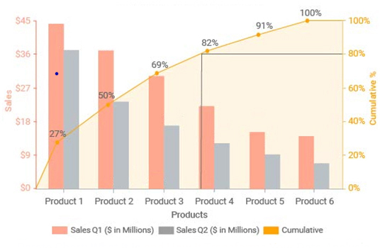
A Pareto Diagram is a specialized bar chart, often used in quality management, that combines frequency data with cumulative frequency. It visually displays the "vital few" factors contributing to a specific problem, ranked from most to least impactful. The "80/20 rule" often applies: 80% of the effects come from 20% of the causes.
Applying the Pareto Diagram in Oil & Gas:
In the oil and gas sector, Pareto Diagrams can be invaluable for tackling various challenges, such as:
- Safety Incidents: Analyzing the root causes of safety incidents can pinpoint the most frequent contributors and guide focused safety improvement efforts.
- Production Downtime: Identifying the leading causes of production downtime can help optimize equipment maintenance schedules and reduce operational losses.
- Environmental Non-Compliance: Analyzing the frequency of non-compliance issues can help prioritize efforts to improve environmental performance.
- Project Delays: Identifying the most significant factors contributing to project delays can help streamline workflows and improve project management.
How to Create a Pareto Diagram:
- Identify the Problem: Clearly define the specific area of concern, like equipment failures, safety incidents, or production issues.
- Collect Data: Gather data on the frequency of each contributing factor over a defined period.
- Rank the Factors: Arrange the factors in descending order based on their frequency of occurrence.
- Create the Diagram: Construct a bar chart with factors on the x-axis and frequency on the y-axis. Add a cumulative frequency line to show the overall impact of the factors.
Benefits of Using a Pareto Diagram:
- Focus on the Vital Few: Pareto diagrams highlight the most impactful factors, enabling resources to be directed strategically.
- Improved Decision-Making: The visual representation helps stakeholders understand the problem's root causes and make informed decisions.
- Effective Prioritization: The diagram prioritizes the most significant areas for improvement, leading to more efficient resource allocation.
- Measurable Results: The use of data and the visual representation allow for tracking progress and measuring the effectiveness of improvement initiatives.
Beyond the Basics:
While the "80/20 rule" provides a useful guideline, it's important to remember that the specific percentage distribution can vary depending on the context. Data analysis and careful interpretation are key to maximizing the value of the Pareto Diagram.
In Conclusion:
The Pareto Diagram is a powerful tool for problem-solving and improvement in the oil and gas industry. By providing a clear visual representation of the most significant contributing factors, it enables teams to prioritize their efforts and achieve tangible results.
Test Your Knowledge
Quiz: Prioritizing Problems in Oil & Gas: The Power of the Pareto Diagram
Instructions: Choose the best answer for each question.
1. What is a Pareto Diagram primarily used for?
(a) Tracking project timelines (b) Identifying and prioritizing problem contributors (c) Analyzing financial data (d) Predicting future trends
Answer
(b) Identifying and prioritizing problem contributors
2. The "80/20 rule" in the context of a Pareto Diagram suggests that:
(a) 80% of problems are caused by 20% of factors. (b) 20% of problems are caused by 80% of factors. (c) 80% of solutions are found by 20% of the team. (d) 20% of solutions are found by 80% of the team.
Answer
(a) 80% of problems are caused by 20% of factors.
3. Which of the following is NOT a benefit of using a Pareto Diagram?
(a) Improved decision-making (b) Effective resource allocation (c) Guaranteed problem resolution (d) Measurable results
Answer
(c) Guaranteed problem resolution
4. How is a Pareto Diagram constructed?
(a) By plotting data points on a scatter plot. (b) By creating a bar chart with frequency on the x-axis. (c) By using a pie chart to represent the frequency of factors. (d) By creating a bar chart with factors on the x-axis and frequency on the y-axis, with a cumulative frequency line.
Answer
(d) By creating a bar chart with factors on the x-axis and frequency on the y-axis, with a cumulative frequency line.
5. What is the first step in creating a Pareto Diagram?
(a) Gather data on the frequency of each factor. (b) Rank the factors in descending order of frequency. (c) Clearly define the problem you are trying to solve. (d) Construct the diagram with bars and a cumulative frequency line.
Answer
(c) Clearly define the problem you are trying to solve.
Exercise: Applying the Pareto Diagram to Production Downtime
Scenario: An oil & gas company is experiencing frequent production downtime due to equipment malfunctions. They have collected data on the causes of downtime over the past 3 months:
| Cause of Downtime | Frequency | |---|---| | Pump Failure | 25 | | Valve Malfunction | 15 | | Sensor Error | 10 | | Electrical Issues | 8 | | Other | 2 |
Task:
- Construct a Pareto Diagram based on the provided data.
- Identify the top 2 contributing factors to production downtime.
- Suggest 1 specific action for each of the top 2 factors that could help reduce downtime.
Exercise Correction
1. Pareto Diagram:
The diagram should show:
- Bars representing each cause of downtime, with the height corresponding to the frequency.
- A cumulative frequency line showing the total percentage of downtime accounted for by each factor.
2. Top 2 Contributing Factors:
- Pump Failure (25 occurrences)
- Valve Malfunction (15 occurrences)
3. Action Suggestions:
- Pump Failure: Implement a predictive maintenance program for pumps, using sensors and data analysis to predict potential failures and schedule proactive maintenance.
- Valve Malfunction: Invest in high-quality, durable valves with a proven track record of reliability. Regularly inspect and maintain valves to ensure optimal performance.
Books
- "The Pareto Principle: How to Achieve Extraordinary Results with Ordinary Efforts" by Richard Koch: A comprehensive guide to applying the 80/20 rule in various fields, including business and personal life.
- "Quality Management for the Oil & Gas Industry" by A.K. Verma: Explores various quality management techniques, including Pareto analysis, in the oil and gas context.
- "Statistical Process Control for Process Industries" by Douglas C. Montgomery: Provides a detailed understanding of statistical methods used in quality management, including the use of Pareto diagrams.
Articles
- "The Pareto Principle: A Powerful Tool for Project Management" by Project Management Institute: Discusses the application of Pareto analysis in project management, emphasizing its use for identifying and prioritizing critical tasks.
- "Pareto Analysis: A Powerful Tool for Root Cause Analysis" by ASQ (American Society for Quality): Explains the steps involved in conducting Pareto analysis for root cause identification and problem-solving.
- "How to Use Pareto Charts for Process Improvement in the Oil & Gas Industry" by Schlumberger (available on their website): Provides practical insights on utilizing Pareto diagrams for process optimization in oil and gas operations.
Online Resources
- Wikipedia: Pareto Principle (https://en.wikipedia.org/wiki/Pareto_principle): A detailed explanation of the Pareto principle, its history, and applications.
- ASQ: Pareto Diagram (https://asq.org/quality-resources/pareto-diagram): A comprehensive guide on Pareto diagrams, including their construction, interpretation, and applications.
- Six Sigma: Pareto Analysis (https://sixsigma.us/pareto-analysis): A resource providing a practical understanding of Pareto analysis, its benefits, and its role in Six Sigma methodology.
Search Tips
- "Pareto diagram oil and gas": This will return results focusing on the use of Pareto diagrams in the oil and gas industry.
- "Pareto analysis root cause analysis": This will lead you to resources explaining how to use Pareto diagrams for root cause identification and problem-solving.
- "Pareto chart excel": This will show you how to create a Pareto diagram using Microsoft Excel.
Techniques
Chapter 1: Techniques for Constructing Pareto Diagrams
This chapter details the specific techniques involved in creating effective Pareto diagrams for analyzing problems within the oil and gas industry. The process goes beyond simply creating a bar chart; it involves careful data collection, analysis, and interpretation.
1. Defining the Problem and Scope: Before beginning data collection, clearly define the problem you are trying to solve. Be specific. For example, instead of "equipment failures," specify "failures of high-pressure valves on offshore platforms." Defining a clear scope ensures relevant data is collected and prevents the diagram from becoming too unwieldy.
2. Data Collection and Categorization: Gather comprehensive data related to the defined problem over a relevant time period. This might involve reviewing incident reports, maintenance logs, production records, or other relevant sources. Categorize the data into distinct, mutually exclusive categories representing potential root causes. Ensure data consistency and accuracy – inconsistent or inaccurate data will lead to misleading results.
3. Frequency Counting and Ranking: Count the occurrences of each category. This represents the frequency of each contributing factor. Rank the categories in descending order based on their frequency, from most frequent to least frequent.
4. Calculating Cumulative Frequency: Determine the cumulative frequency for each category. This is the running total of frequencies, starting with the most frequent category. This cumulative frequency will form the basis for the cumulative percentage line on the Pareto diagram.
5. Creating the Chart: Construct a bar chart with the categories on the horizontal (x) axis and frequency on the vertical (y) axis. The height of each bar represents the frequency of that category. Add a line graph representing the cumulative percentage. This line will show the cumulative impact of each category. Clearly label axes, bars, and the cumulative line. Include a title that clearly states the problem being analyzed and the time period covered.
6. Interpreting the Diagram: Focus on the left side of the diagram, where the "vital few" factors are clearly highlighted. Identify the categories contributing to the largest percentage of the problem (e.g., the 80% of effects). These categories should be the primary focus of improvement efforts. Remember that the 80/20 rule is a guideline, not a strict law. The exact distribution may vary.
7. Iterative Refinement: A Pareto diagram is not a static tool. After implementing improvement initiatives based on the initial diagram, collect new data and recreate the diagram to assess the effectiveness of your interventions. This iterative process will continuously refine your understanding of the problem and guide further improvements.
Chapter 2: Models and the Pareto Principle
This chapter explores the underlying models and the theoretical basis of the Pareto Diagram, specifically the Pareto Principle (80/20 rule).
The Pareto Principle: The Pareto Principle, also known as the 80/20 rule, suggests that approximately 80% of effects come from 20% of causes. This principle is an empirical observation, not a mathematical law, meaning it's not always perfectly 80/20 but frequently approximates this distribution across various fields. In the context of Pareto diagrams, this means a relatively small number of factors often contribute to the majority of a problem.
Applying the Model to Oil & Gas: The Pareto principle finds relevance in various aspects of the oil and gas industry:
- Safety incidents: A small percentage of contributing factors might account for most accidents.
- Equipment failures: A few specific equipment types or failure modes might cause a disproportionately large share of downtime.
- Production bottlenecks: A few key processes or factors may be responsible for the majority of production delays.
- Environmental violations: A limited number of sources or activities may lead to most environmental non-compliance issues.
Limitations of the Model: While powerful, the Pareto principle is not universally applicable. The 80/20 ratio is an approximation, and the actual distribution might vary. Additionally, focusing solely on the "vital few" can neglect the "trivial many," which, collectively, might still contribute significantly to the overall problem. Careful analysis is necessary to avoid overlooking important factors.
Beyond 80/20: It's crucial to interpret the Pareto diagram holistically. The specific percentage split (e.g., 75/25, 90/10) is less important than the identification of the most significant contributing factors. The diagram’s value lies in its ability to prioritize improvement efforts.
Chapter 3: Software and Tools for Creating Pareto Diagrams
This chapter reviews various software options and tools available for creating Pareto diagrams, ranging from simple spreadsheet software to dedicated statistical packages.
1. Spreadsheet Software (e.g., Microsoft Excel, Google Sheets): These are readily accessible and sufficient for creating basic Pareto diagrams. Built-in charting features allow for easy creation of bar charts and the addition of a cumulative frequency line. However, more advanced statistical analysis might require external add-ins or more sophisticated software.
2. Statistical Software (e.g., Minitab, SPSS, R): These packages offer more advanced statistical capabilities, allowing for more robust data analysis and the generation of more detailed Pareto diagrams. They often include functionalities for hypothesis testing and other statistical methods that can provide deeper insights.
3. Business Intelligence (BI) Tools (e.g., Tableau, Power BI): BI tools are particularly useful for visualizing large datasets and creating interactive Pareto diagrams. They often offer features for data exploration, filtering, and dynamic updates, enabling a more interactive analysis.
4. Specialized Quality Management Software: Some software packages are specifically designed for quality management and include built-in Pareto chart functionalities. These tools often integrate with other quality management tools and methodologies.
Choosing the Right Tool: The optimal software choice depends on factors such as:
- Data size and complexity: For smaller datasets, spreadsheet software is sufficient. Larger, more complex datasets might require specialized statistical or BI tools.
- Required statistical analysis: If advanced statistical analysis is needed, statistical software is necessary.
- Budget and available resources: The cost and availability of different software packages should be considered.
- User expertise: The software's user-friendliness should match the user's technical skills.
Chapter 4: Best Practices for Effective Pareto Diagram Usage
This chapter provides best practices for maximizing the effectiveness of Pareto diagrams in the oil and gas industry.
1. Data Quality is Paramount: Inaccurate or incomplete data will render the diagram useless. Ensure data is collected consistently, accurately, and from reliable sources. Regularly audit data collection processes to maintain quality.
2. Define Clear Categories: Categories should be mutually exclusive and comprehensive, covering all potential contributing factors. Avoid overly broad or ambiguous categories.
3. Appropriate Timeframe: Choose a timeframe that is relevant to the problem being analyzed. Too short a period might not reveal significant trends, while too long a period might obscure important changes.
4. Visual Clarity: The diagram should be clear, easy to understand, and visually appealing. Use appropriate labels, legends, and a consistent color scheme.
5. Don't Stop at the Diagram: The Pareto diagram is a starting point, not the end. Use the insights gained from the diagram to initiate investigations, develop corrective actions, and implement improvement initiatives.
6. Track Progress: After implementing corrective actions, recreate the Pareto diagram after a suitable time period to assess the effectiveness of your interventions. This iterative approach is crucial for continuous improvement.
7. Involve Stakeholders: Engage stakeholders throughout the process, from data collection to interpretation and action planning. This promotes ownership and buy-in.
8. Combine with Other Methods: Pareto diagrams are most effective when used in conjunction with other root cause analysis techniques, such as Fishbone diagrams or 5 Whys, to delve deeper into the underlying causes of identified issues.
Chapter 5: Case Studies: Pareto Diagrams in Action in the Oil & Gas Industry
This chapter presents case studies illustrating the application of Pareto diagrams to solve specific problems in the oil and gas industry. These examples highlight the practical benefits and demonstrate the process from problem identification to solution implementation.
Case Study 1: Reducing Offshore Platform Downtime: An offshore oil platform experienced frequent downtime due to various equipment failures. A Pareto diagram was created using maintenance logs, categorizing failures by equipment type. The diagram revealed that a small percentage of equipment types (e.g., high-pressure valves) were responsible for the majority of downtime. Targeted maintenance and preventative measures focused on these critical equipment types significantly reduced overall downtime.
Case Study 2: Improving Safety Performance in a Refinery: A refinery experienced a high number of safety incidents. A Pareto diagram was created based on incident reports, categorizing incidents by type and root cause. The analysis highlighted specific contributing factors (e.g., inadequate training, lack of PPE) that accounted for the majority of incidents. Focused training programs and improvements in safety protocols led to a marked reduction in safety incidents.
Case Study 3: Streamlining a Pipeline Construction Project: A major pipeline construction project was experiencing significant delays. A Pareto diagram, based on project management data, was used to identify the most significant factors causing delays (e.g., permitting issues, material shortages). Addressing these critical path issues resulted in a more efficient workflow and reduced overall project duration.
These case studies illustrate the versatility and effectiveness of Pareto diagrams in addressing diverse challenges across various facets of the oil and gas industry, leading to improved safety, efficiency, and environmental performance. Each case demonstrates the importance of iterative application, data-driven decision making, and a focus on the "vital few" factors to achieve significant results.
- Arrow Diagram Arrow Diagrams: Visualizing P…
- Arrow Diagram Method ("ADM") Unveiling the Arrow Diagram M…
- Arrow Diagramming Arrow Diagramming: A Simple T…
- Arrow Diagramming Arrow Diagramming: A Visual T…
- Arrow Diagramming Method Unpacking the Arrow: A Guide …
- Dependency Diagram Dependency Diagrams: Mapping …
- Logic Diagram Logic Diagrams: The Blueprint…
- Network Diagram Network Diagrams in Oil & Gas…
- Network Diagram Visualizing the Flow: Underst…
- Network Diagram Network Diagrams: Charting th…
- Precedence Diagram Navigating Project Complexity…
- Precedence Diagram Unraveling the Path: Understa…
- Precedence Diagram Method Arrow The Arrow: A Powerful Symbol …
- Precedence Diagram Method ("PDM") Mapping Your Project's Path: …
- Precedence Diagram Method ("PDM") Unraveling the Logic: Underst…
- Diagramming Diagramming: A Visual Guide t…
- Flow diagram Flow Diagrams: The Blueprint …
- PNID (Piping and Instrument Diagram) Understanding PNID in Oil & G…
- Flow Diagram Flowing Through Information: …
- Pareto Diagram Unlocking Efficiency in Oil &…
- Application for Expenditure Justification Navigating the Appl… Project Planning & Scheduling
- Budgeted Cost of Work Scheduled ("BCWS") Understanding Budge… Cost Estimation & Control
- Battery limit Understanding Batte… General Technical Terms
- DV Tool (cementing) DV Tool: A Crucial … Drilling & Well Completion
- TOC TOC: Understanding … General Technical Terms
Comments